Think about how people actually find an electrician. The power has tripped and won't reset. A landlord needs a safety certificate by the end of the month. Someone has bought an electric car and has nowhere to charge it. In almost every case they're on a phone, a bit stressed, and they want to know three things fast: do you do this, do you cover my area, and can I trust you in my house.
An electrician's website doesn't need to be clever. It needs to answer those three questions before the visitor loses interest, then make ringing you the easiest thing on the screen. We build websites for electricians, and this is what we'd put on the page, roughly in order.
The top of the page does most of the work
Most visitors decide within a few seconds whether to stay, and plenty never scroll. So the first screen on a phone should carry:
- What you do, in plain words: domestic, commercial, EV chargers, whatever is true for you.
- Where you work, by town, not 'central belt and beyond'.
- A phone number that rings when it's tapped. Not a picture of a number, and not buried in the footer.
- Your registration, shown as a logo people recognise.
Registration is the trust signal people look for
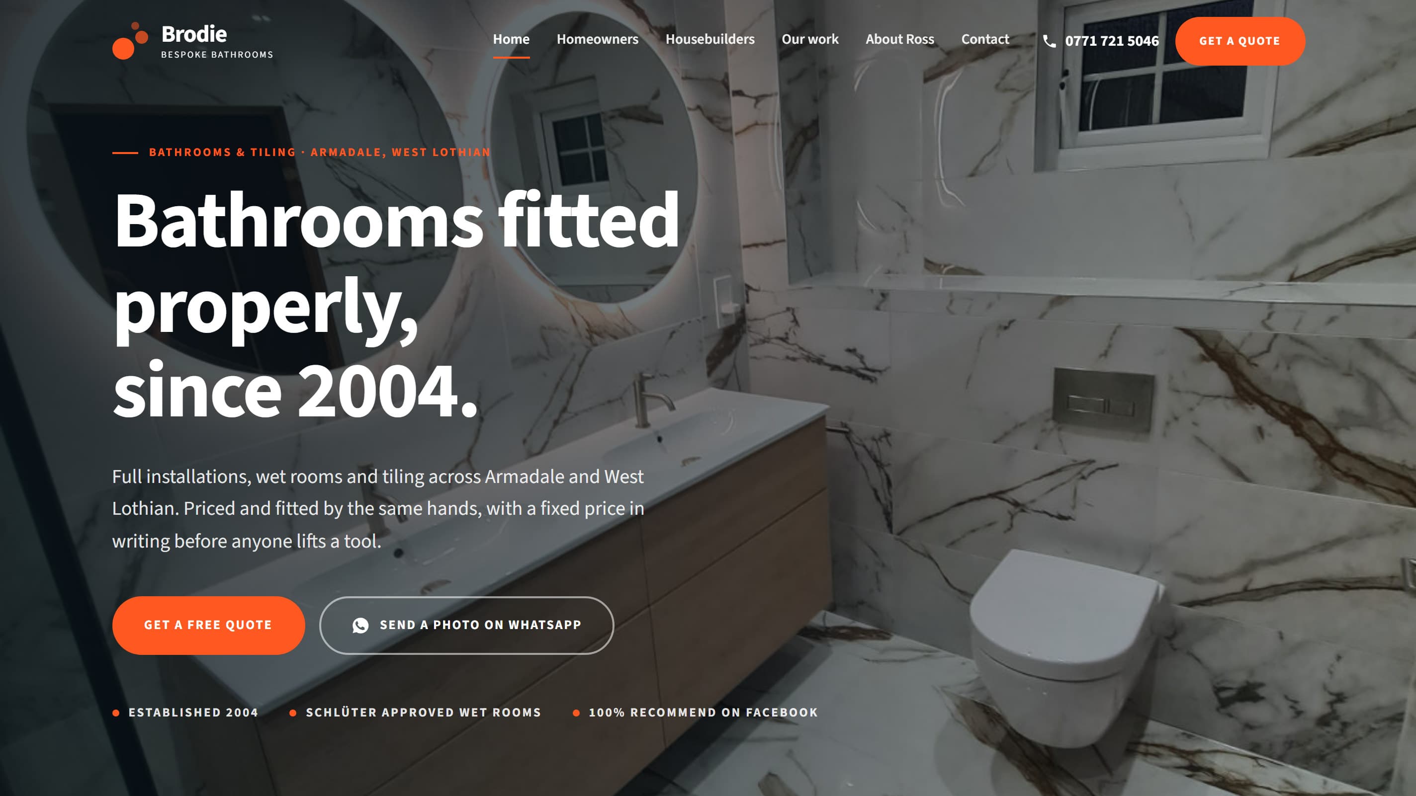
Letting a stranger work on the wiring in your home is a big ask. The quickest way to earn it is to show you're registered, which in Scotland usually means SELECT, NICEIC or NAPIT. Put the logo near the top, say it in words too, and link to that body's public register so anyone can check you're on it. It takes a minute, and it answers the question a careful customer is already asking.
The same goes for insurance. If you're insured, say so plainly.
Photos of your work, not stock photos
Every electrician's site with a stock photo of a smiling model holding a screwdriver looks like every other one. A photo of a consumer unit you've just fitted, with the cables dressed neatly, says more about your work than a paragraph ever could. Customers notice tidy work even when they couldn't tell you why.
Your phone is fine. Take a photo at the end of every job you're proud of, and in a couple of months you'll have a better gallery than most.
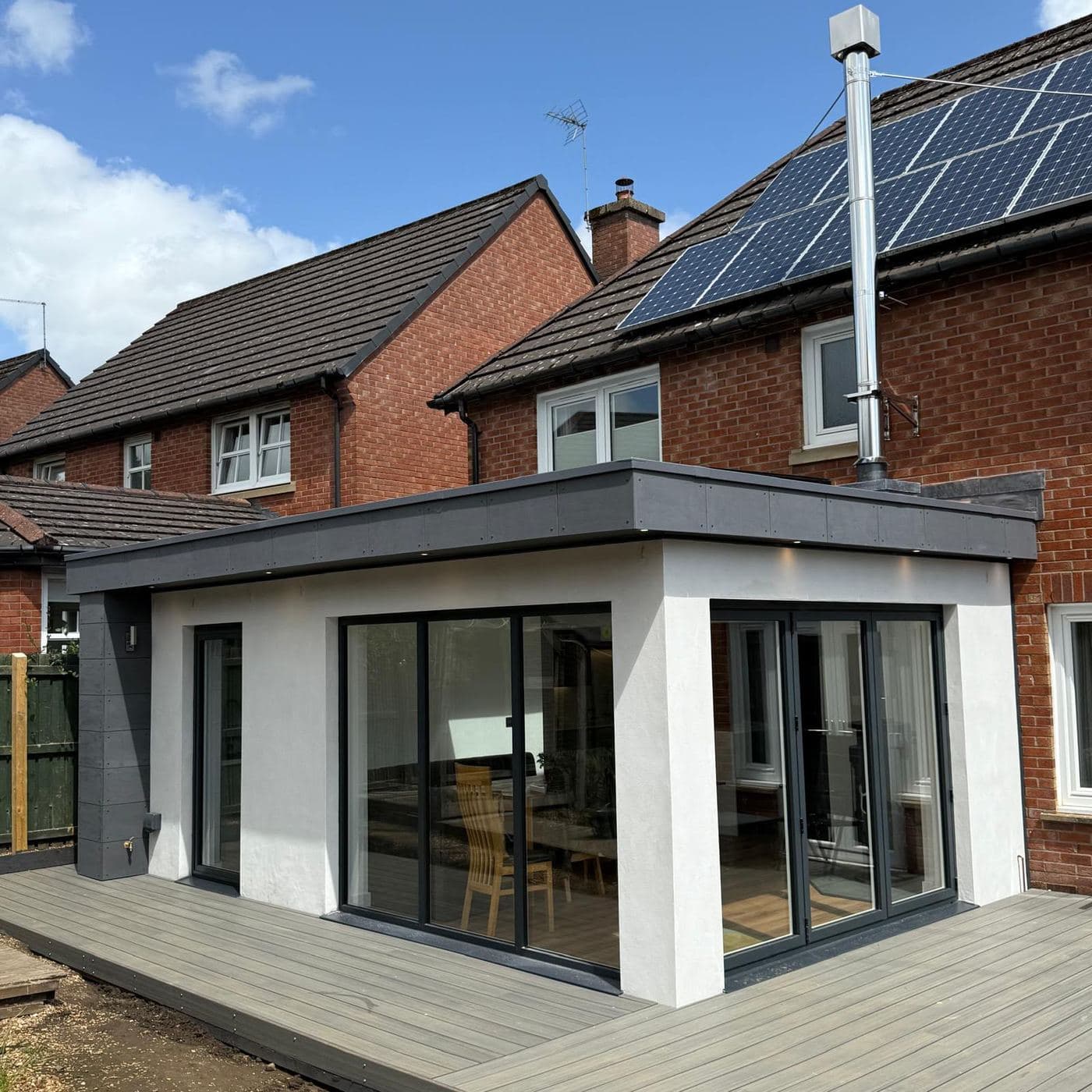
A customer can't judge your wiring. They can judge whether you look like someone who takes care, and your photos are how they decide.
Split the work the way customers search for it
A homeowner with a flickering light and a facilities manager planning a three-phase upgrade are looking for different things. Give each kind of work its own short section, or its own page if you do a lot of it:
- Domestic: rewires, fault finding, extra sockets, lighting.
- Safety certificates: Electrical Installation Condition Reports for landlords, who in Scotland need one at least every five years.
- EV chargers and solar, if you fit them.
- Commercial and industrial, if you take it on.
Only list what you actually do. A long list of work you'd rather not take wastes your time on the phone, and theirs.
Reviews where they can be seen
Your Google reviews are the most convincing thing about you, and most sites hide them or leave them out. Show a handful of recent ones on the page, with first names and towns, and link through to your Google profile so people can see they're real.
A short enquiry form, for people who can't call
Plenty of people find you in the evening or at work, when they can't ring. Give them a form with as few boxes as possible: name, phone number, postcode and what's wrong. Let them attach a photo, because a picture of a scorched socket or an old fuse box tells you more than a description, and can save a wasted visit.
What it doesn't need
- A slideshow. It slows the page down, and nobody waits for the third slide.
- A chatbot. Your customers want you, not a script.
- Callout promises you can't keep. If you don't answer at 2am, don't say 24/7.
- Pages of words nobody reads. Short and specific beats long and vague.
And it has to be fast
People open these sites in a loft, on a site, or in a car park with one bar of signal. A page that takes eight seconds to load has lost them to the next name in the results. Keep it light, with small images and nothing that isn't needed, and it'll load before they've thought about going back.
None of this is complicated, and that's rather the point. If you'd like a site built this way, it's the kind of website we build for trades. And if you already have one, get in touch and we'll tell you honestly what's stopping it making the phone ring.