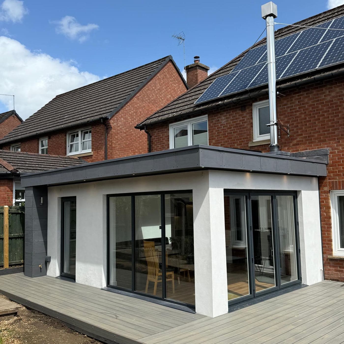
An electrician gets rung in a hurry. A joiner or builder usually doesn't. Somebody has been thinking about the extension for a year, has a rough number in their head, and is about to spend more on this than on anything except the house itself. They'll look at your website in the evening, show it to whoever they live with, and put it next to two other names.
So the job of the site is different. It isn't to catch a panicked tap on a phone number. It's to survive a slow comparison against two other firms and come out of it as the one that looks safe. Most of that comes down to proving you finish what you start.
Show whole jobs, not a gallery of nice corners
Most trade sites carry twenty photos with no explanation: a worktop, a bit of coving, somebody's van. They all look fine and they prove nothing. What a customer wants to know is whether you can take a job like theirs from a wall coming down to a room they can sit in.
Show three or four jobs properly instead. What the customer wanted, what was involved, roughly how long it took, and the finished room. Before, during and after in one place is worth more than any number of loose photos, because the during shot is the one nobody else is willing to put up.
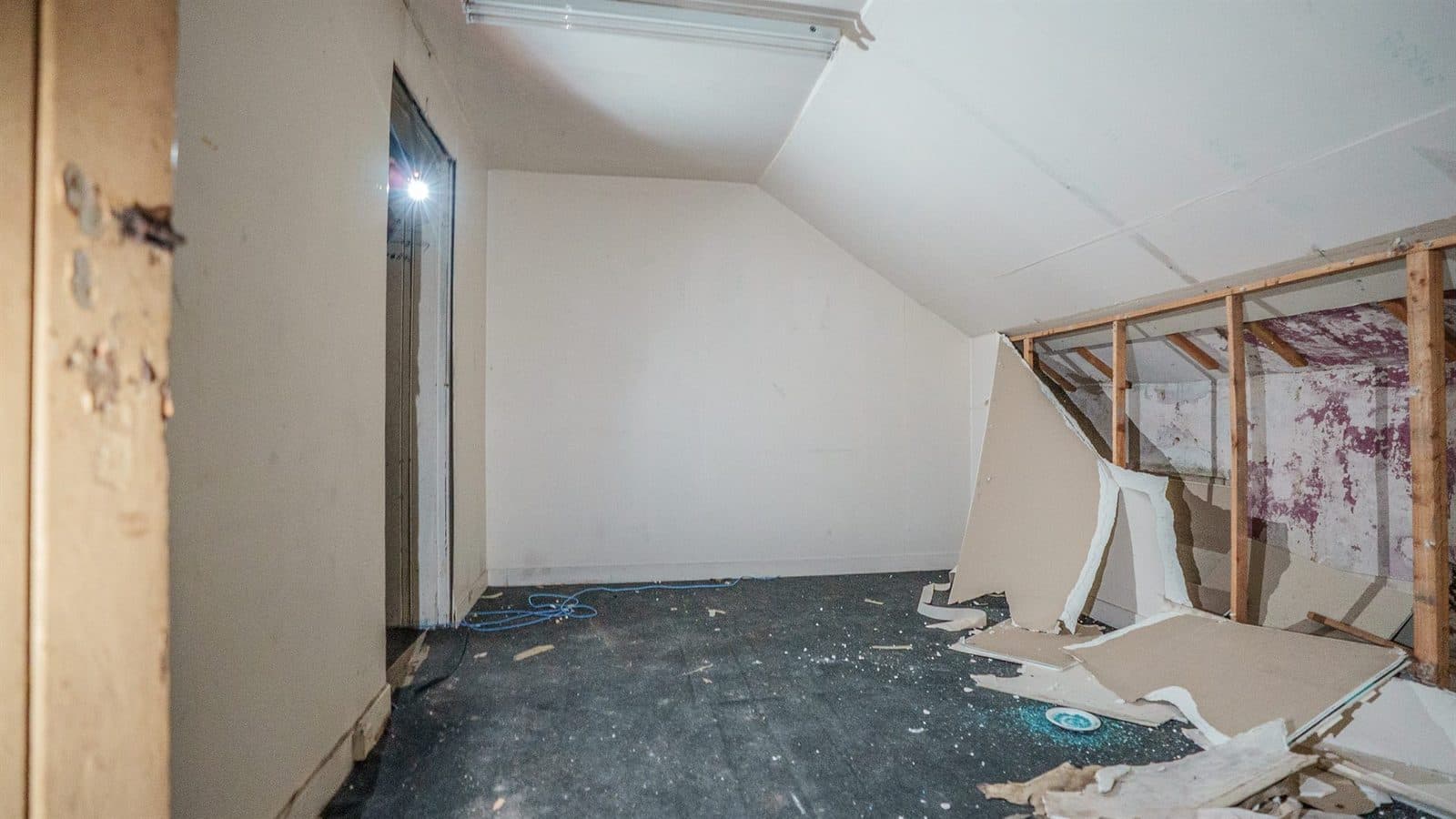
Anyone can photograph a finished kitchen. Showing the middle of the job is how you prove you were there for it.
Say what you take on, and what you turn down
A builder who does everything reads like a builder who does nothing in particular. Give the work its own short sections, in the words people use:
- Extensions and structural work, including steels and knock-throughs.
- Conversions: lofts, garages, outbuildings.
- Kitchens and bathrooms, fitted start to finish.
- Joinery: doors, stairs, fitted storage, decking.
- The size of job you actually want, which is the one most sites leave out.
Being specific about the work you want more of is the cheapest filter you have. It costs nothing on the page and saves an afternoon of phone calls about jobs you were never going to take.
The first screen still has to do the basics
Slower decision or not, nobody scrolls a site that hasn't told them what it is. The top of the page on a phone should say what you build, the towns you cover by name, and how to start a conversation, with a number that rings when it's tapped.
Structural work needs different proof from a kitchen fit
Once a job involves taking out a supporting wall, the customer's worry stops being about finish and starts being about whether it's done properly. Say that you work to a building warrant, that you deal with the council and building control, and that you work from a structural engineer's drawings. Say who signs it off at the end.
None of that photographs. It's also the part a nervous customer is quietly worried about, so it has to be written down.
Reviews, with names and places on them
Your Google reviews are the most convincing thing about you and most sites leave them off. Put a handful of recent ones on the page with first names and towns, and link through to your profile so anyone can check they're real. If the profile itself is thin, getting onto Google Maps properly is the job to do first.
A form that starts a real conversation
Ask for a postcode, what they're thinking of, roughly when, and let them attach photos. A picture of the back of the house tells you more than three paragraphs, and often saves a visit to a job that was never going to suit you.
What it doesn't need
- A twenty-photo gallery with no captions. Fewer jobs, explained, beat more jobs, shown.
- A price list, when every job is priced on its own. A starting figure and an honest 'it depends' does the work.
- 'No job too small', if you would rather not do the small ones.
- A long page about the journey. People want the work, not the story.
And it has to load on a building site
Half the people who open your site are doing it on a phone with one bar, and the other half are doing it on the sofa while the telly's on. Keep it light, keep the photos small, and it'll be up before anyone thinks about going back to the results.
None of this needs a big site. Four or five pages, done carefully, beat twenty done vaguely. It's the kind of website we build for trades, and if you've already got one, get in touch and we'll tell you honestly what's stopping it bringing work in.